|
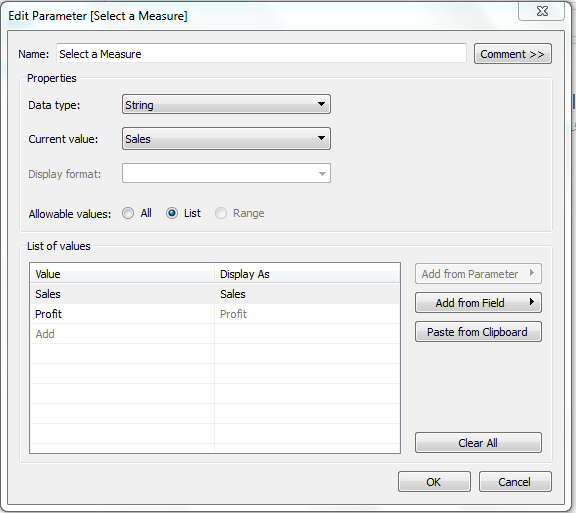
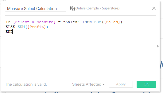
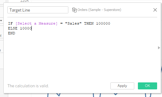
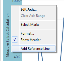
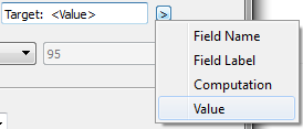
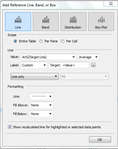
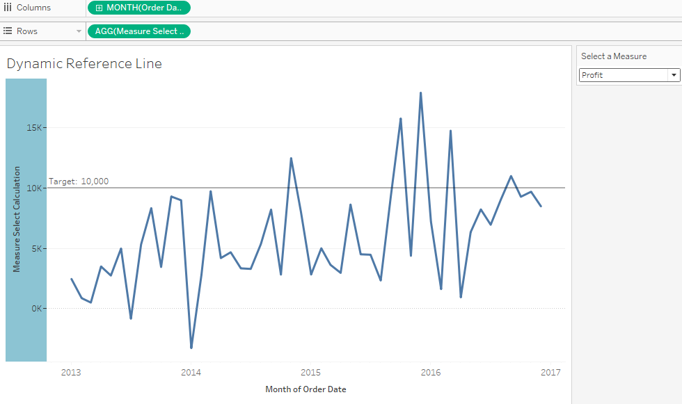
Are you interested in making your visualizations more dynamic? Enter Tableau parameters! Parameters allow the end user to single select a value from a list or range of values. In this example, we'll show how to use a parameter to change the measure and reference line value. 1. Open a data source, such as Sample – Superstore.xlsv 2. Drag Orders onto the data canvas 3. Create a new worksheet titled Dynamic Reference Line 4. Drag Order Date onto the Columns Shelf and aggregate at month as a date value 5. Create a new Parameter called Select a Measure 6. Set Data Type to String and use a list for Allowable Values 7. In the List of Values area below, enter Sales and Profit As always, a parameter needs to be used in conjunction with either a filter or calculated field. 8. Create a new calculated field titled Measure Select Calculation; edit as shown below: This calculated field instructs Tableau to determine what the parameter value is set to. If it’s set to sales, return SUM (sales); if it isn’t, return SUM (Profit). 9. Drag Measure Select Calculation to the Rows Shelf 10. Right click the Measures Parameter and select Show Parameter Control The measure displayed is now determined by what the parameter is set to. We’ll use a similar concept to create the dynamic reference line. 11. Create a new calculated field called Target Line; edit as shown below: This calculated field instructs Tableau to determine what the parameter value is. If the parameter is set to “Sales”, return a value of 100,000; if the parameter isn’t equal to “Sales”, return a value of 10,000. 12. Drag Target to the Level of Detail and change the aggregation to AVG 13. Right click on the Y-axis and select Add Reference Line 14. Select Line as the Reference Line type & Set Scope to Entire Table 15. Under Line, use the Value drop-down menu to select AVG (Target Line) 16. Use the second drop-down menu to change the Aggregation to Average 17. Set Label to Custom; in the box to the right, type Target: 18. Click the right arrow next to the drop down menu and select Value The Reference Line settings should now look like this: 19. Click OK to return to the view
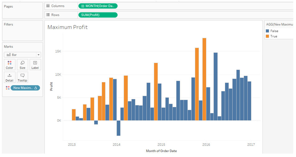
Tableau now displays a reference line based on the parameter selection. A common use case is to determine when a new event occurs, such as when a new maximum profit is achieved. 1. Create a new worksheet titled Maximum Profit 2. Drag Order Date onto the Columns Shelf and aggregate as month as a date value 3. Drag SUM (Profit) onto the Rows Shelf 4. Change the Mark Type to Bar Each bar visualizes monthly total profit. The goal is to use color to highlight when a new maximum profit has been achieved; this requires that the current mark be compared the remaining marks. 5. Create a new calculated field titled New Max Profit; edit the calculation as shown below: The logic instructs Tableau to compare the each month’s sum profit against the running maximum of sum profit up to and including the current month, which results in a true/false outcome. 6. Drag New Maximum Profit onto the Color Shelf The running maximum is a table calculation being computed table across (the default method). Consider the first month, January 2013. January 2013’s total profit was $2,450. Since the running maximum is being computed table across, the running maximum for January 2013 only includes one value, which also equals $2,450. Since these values are equal to each other, it’s a new maximum value.
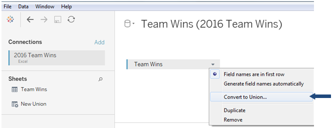
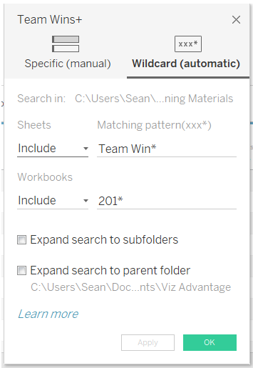
Let’s look at February 2013 next. February 2013’s total profit was $862; the running maximum now includes January 2013 and February 2013. The maximum value from these two months is still the $2,450 from January. This means that the current month’s profit does not equal the running maximum, meaning a new maximum value has not been achieved. Starting in 9.3, Tableau introduced the ability to combine, or union, disparate data sources. This feature is handy as the data needed for analysis is frequently split across many different files. For example, suppose that you have two Microsoft Excel files that analyzed team wins data; the first file contains the 2016 season data while the second file contains the 2017 season data. Prior to 9.3, you'd have to combine these files outside of Tableau, which is less efficient and takes you out of the analytical flow. The good news is that this process is much easier with Tableau File Union! This feature can be used for flat files such as MS Excel and text as well as with several common relational databases. In this case, simply connect to the first Excel file and add the desired sheet to the canvas; then convert that data source to a union. Tableau displays a new dialog box, which allows the user to select between a specific and wildcard union. The specific union works well for combining sheets from the same workbook together while the wildcard union allows the user to combine disparate files together. The wildcard union allows the user to select which workbooks as well as which worksheets contained in the defined workbooks should be combined. In the example above, the asterisk is used to instruct Tableau to combine any sheet that begins with a sheet name of "Team Win" from workbooks that have a name beginning with "201". By default, Tableau will look in the same file location as the original data source; however, this can be changed to look in subfolders and the parent folder.
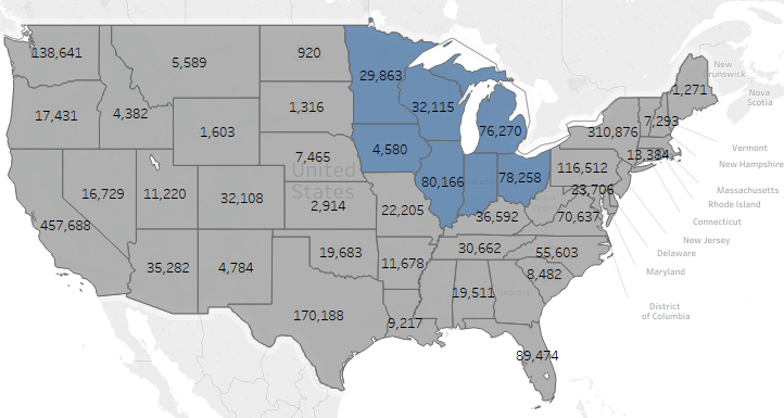
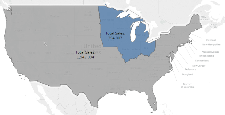
Starting in Tableau 10, users have the ability to create custom territories without having to display the original geographic aggregation. This feature is extremely helpful when the user needs to display aggregated totals on a map. Consider the following use case: a sales manager is responsible for the sales performance of Illinois, Indiana, Iowa, Michigan, Minnesota and Wisconsin. How can the manager quickly see the performance of the group as a whole? In previous versions of Tableau, there wasn't an easy way to display the answer to this question on a map. Using custom territories, users can now remove the State geographic aggregation from the view, which results in an aggregated total for all groups displayed. This allows the sales manager to quickly see how the Midwest region is performing in relation to the remaining total. Users can also create and display multiple custom territories on the same map.
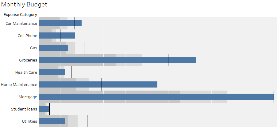
A bullet graph is a variation of a bar graph designed to replace dashboard gauges and meters. A bullet graph is commonly used to compare a primary measure to one or more other measures in the context of qualitative ranges of performance such as poor, satisfactory, and good; a standard bullet graph use case would be to compare actual values versus a budget.
The example below shows typical monthly expenses broken out by category. Actual expenses are encoded in the length of the bar while the black line represents the monthly budget amount. The dark gray shading represents 60% of the budget total while the light gray shading represents 80% of the budget total. By using a bullet graph, it's easy to see that some expense categories have exceeded the monthly budget. Interested in learning more? Contact us today at info@vizadvantage.com. Parameters are a great way to add interactivity to a worksheet or dashboard; this allows the end user to see which values or metrics are most important to them. I'm originally from Wisconsin, but now live in Colorado. As such, I built a dashboard comparing the major climate characteristics of Denver and Milwaukee. The dashboard can be found here. The metrics include:
Tableau has impressive mapping capabilities and continues to refine these abilities in each new release. Living in Colorado, it comes as no surprise that I really enjoy hiking. In Colorado, there are 53 mountain peaks that are higher than 14,000 feet, which are commonly known as "14ers". I used Tableau to map the location of each of these as well as some other important information, such as what mountain range the peak is in and the standard route difficulty, length and elevation gain. Check out the dashboard here.
Thanks for visiting Viz Advantage! Posts here will focus on Tableau and data visualization tips and tricks as well as example dashboards. For now, please visit my original Tableau blog at www.vizcreations.wordpress.com.
|
AuthorWrite something about yourself. No need to be fancy, just an overview. Archives
March 2019
Categories |


 RSS Feed