|
A bullet graph is a variation of a bar graph designed to replace dashboard gauges and meters. A bullet graph is commonly used to compare a primary measure to one or more other measures in the context of qualitative ranges of performance such as poor, satisfactory, and good; a standard bullet graph use case would be to compare actual values versus a budget. The example below shows typical monthly expenses broken out by category. Actual expenses are encoded in the length of the bar while the black line represents the monthly budget amount. The dark gray shading represents 60% of the budget total while the light gray shading represents 80% of the budget total. By using a bullet graph, it's easy to see that some expense categories have exceeded the monthly budget. Interested in learning more? Contact us today at info@vizadvantage.com. 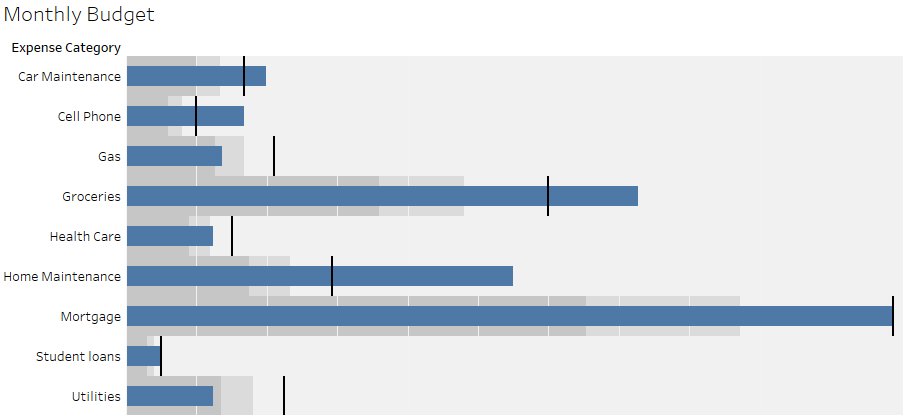
1 Comment
|
AuthorWrite something about yourself. No need to be fancy, just an overview. Archives
March 2019
Categories |
 RSS Feed