Typical Dashboard Mistakes - Part 1
Picture this common scenario as a dashboard developer: You’ve completed all the legwork by gathering requirements, wireframing the initial dashboard, and having your end users test prototypes. You’ve incorporated all feedback and just published the final dashboard to wow your customers – so exciting!
…And then no one uses it. Cue the sad trombone. The bad news is that there are several common mistakes dashboard developers. The good news is that these mistakes are easily fixed. In this post, we’ll cover four of the most common mistakes and conclude with three additional mistakes next time. Today, we’ll cover:
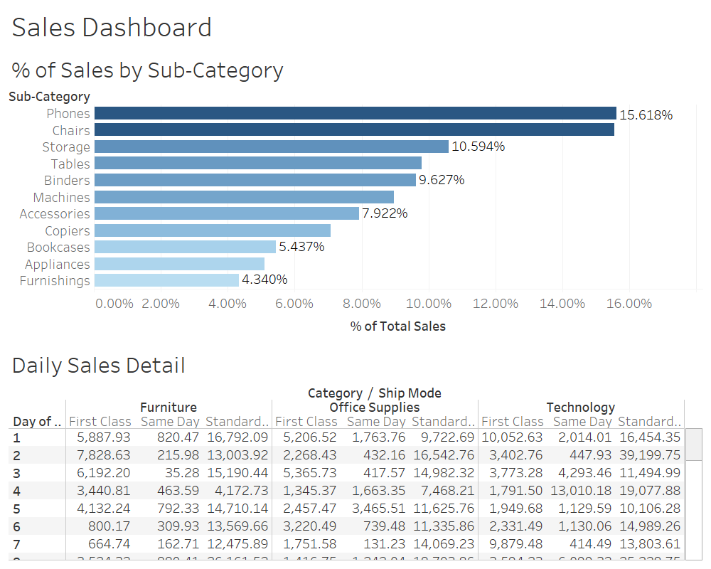
Consider the dashboard below, which displays several visualizations regarding customer metrics. In addition to the use of multiple filters, the Daily Profit by Region visualization has both a horizontal and vertical scrollbar. These layout decisions prevent the end user from understanding the relationship between all values displayed on the dashboard.
…And then no one uses it. Cue the sad trombone. The bad news is that there are several common mistakes dashboard developers. The good news is that these mistakes are easily fixed. In this post, we’ll cover four of the most common mistakes and conclude with three additional mistakes next time. Today, we’ll cover:
- Inability to See Entire View
- Insufficient Context to Make Decision
- Providing Unnecessary Detail
- Forcing Viewer to Work Harder than Necessary
Consider the dashboard below, which displays several visualizations regarding customer metrics. In addition to the use of multiple filters, the Daily Profit by Region visualization has both a horizontal and vertical scrollbar. These layout decisions prevent the end user from understanding the relationship between all values displayed on the dashboard.
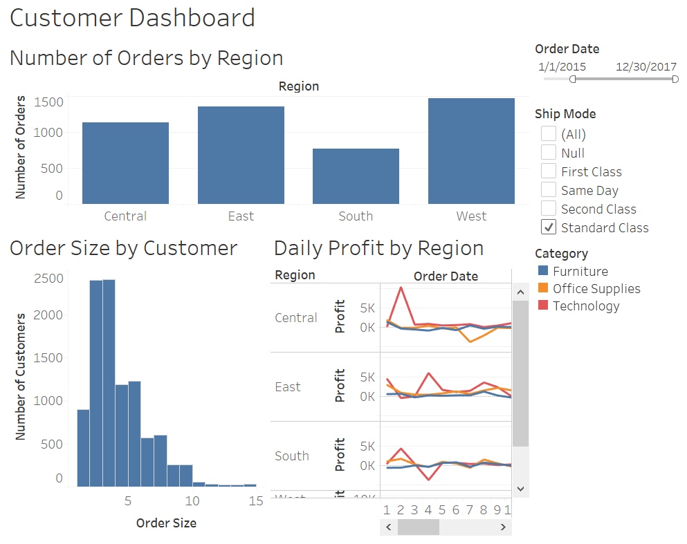
Scrollbars and filters prevent user from seeing entire view
Why is this a problem? The reality is that our short-term memory isn’t very good. Typically, we can remember 5-7 chunks of information at a time. A chunk of information could be total profit, the West Region Sales, or the average customer order size. If a dashboard forces a user to look at multiple screens for important metrics, chances are the metrics on the first screen will be forgotten.
Redesign: Create a summary dashboard that displays all required metrics on a single screen. Link to separate detail dashboards if necessary.
Redesign: Create a summary dashboard that displays all required metrics on a single screen. Link to separate detail dashboards if necessary.
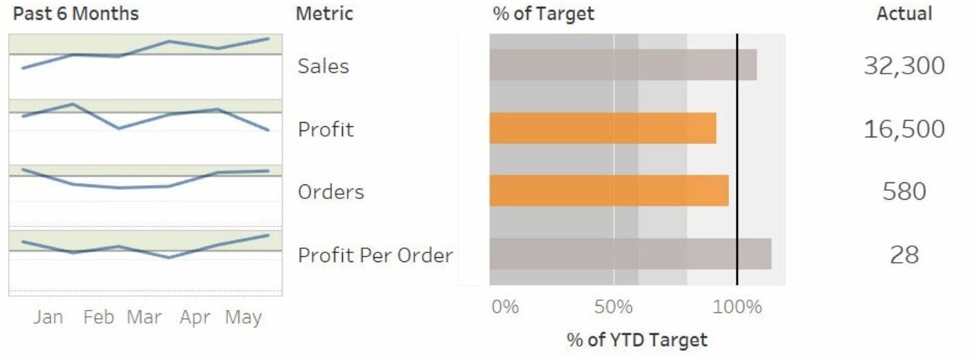
Well-designed Summary Dashboard
Mistake: Insufficient Context to Make Decision
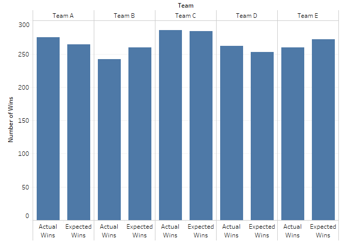
Consider this simple bar graph, which displays the number of wins by team. This visualization provides some information, but it lacks context to make an informed decision.
Consider this simple bar graph, which displays the number of wins by team. This visualization provides some information, but it lacks context to make an informed decision.
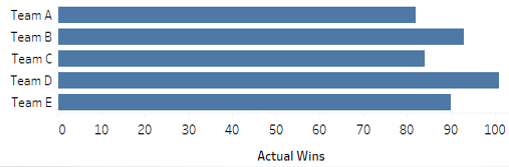
Bar Graph Lacks Context to Support Decision-Making
For example, it might be helpful to understand the relationship between the total number of wins and expected number of wins by team.
Redesign: As discussed in the Bullet Graph post, the simple addition of a target line for the number of expected wins provides useful context; while Team E had 90 wins, it was well short of its expected wins.
Redesign: As discussed in the Bullet Graph post, the simple addition of a target line for the number of expected wins provides useful context; while Team E had 90 wins, it was well short of its expected wins.
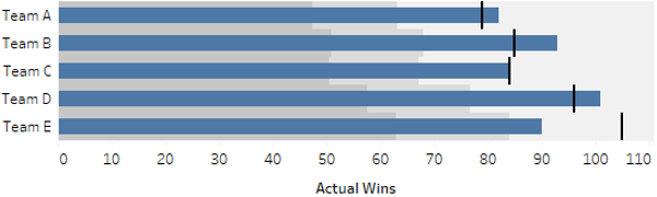
Bullet Graph Provides Context to Support Decision-Making
Mistake: Providing Unnecessary Detail
Remember, a well-designed dashboard should be able to be understood by someone with little to no background information in five seconds or less. That means no complex chart types or unnecessary detail.
Remember, a well-designed dashboard should be able to be understood by someone with little to no background information in five seconds or less. That means no complex chart types or unnecessary detail.
Dashboard Mistake: Providing Unnecessary Detail
Redesign: Remove labels and undue precision. Start with a high-level summary dashboard before linking to supporting detail.
Mistake: Forcing Viewer to Work Harder than Necessary
This mistake boils down to clearly understanding end user requirements. Consider the following bar graph, which again displays the number of actual wins and expected wins by team.
Mistake: Forcing Viewer to Work Harder than Necessary
This mistake boils down to clearly understanding end user requirements. Consider the following bar graph, which again displays the number of actual wins and expected wins by team.
Dashboard Mistake: Graphing Values Indirectly
This visualization is acceptable if the requirement is to have a rough understanding of the variance between these values. However, if the requirement is to directly understand the variance, it does a poor job as it forces the user to mentally calculate the difference.
Redesign: Graph requirements directly when possible. Instead of visualizing both values, this bar graph only visualizes the variance.
Redesign: Graph requirements directly when possible. Instead of visualizing both values, this bar graph only visualizes the variance.
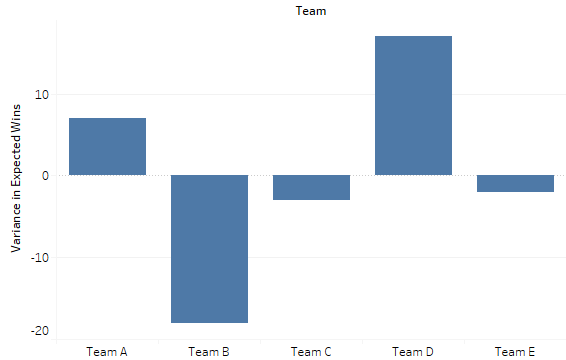
Well-Designed Visualization that Graphs Value Directly