Bar Graph Dos and Don’ts
Bar graphs can easily deceive, either intentionally or unintentionally, if proper design steps aren't taken. Let's start with the good:
DO
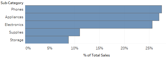
Bar graphs are a great chart type when you need to display a ranking or comparison. This is because we’re great at estimating the length of a bar and comparing it to the length of other bars. This is our strength, as opposed to our weakness of estimating angles – we’re still coming for you, pie chart.
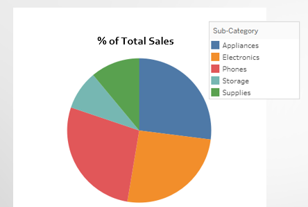
Even though it might not be the first chart you think of, a percent of total comparison is a great use case for a bar chart. Let’s try it out; we’ll start by showing the % of total sales in the commonly accepted pie chart. After a significant amount of time and double checking the slice colors and color legend (don’t lie, you know you did), you probably can come up with an educated guess as to the order of the pie slice sizes. But would you bet on it?
Take that same data, put it in a bar graph, and voila! Instant understanding.
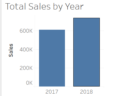
Bar graphs can also be used effectively to compare two date periods, such as late year and this year
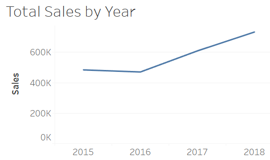
However, if you have three or more date periods, it’s best to use a line to better highlight trends. While bars technically work, it comes back to the data ink ratio; try and use as little ink as possible to visualize relevant data.
DON’T
There is one cardinal rule for bar charts…any guesses? Look at the example below, which visualizes number of wins by team. See anything wrong?
There is one cardinal rule for bar charts…any guesses? Look at the example below, which visualizes number of wins by team. See anything wrong?
It looks harmless - Team C crushed it with 100 wins, while Team D had half as many wins with 50. But wait…if Team C had twice as many wins as Team D, why isn’t Team D’s bar half as long as Team C’s bar? Axis Manipulation! Bonus points if you read that to yourself like Jim Carey says “Prenuptial Agreement” in the movie Liar Liar. Check out the X axis – it doesn’t start at zero! This is what distorts the graph. Had the axis started at zero, the graph would look like this:
Team C is still well ahead of Team D, but now the comparison is accurate. You’ll be surprised at how often you see this in ads. Now you know how to avoid violating the cardinal rule of bar graphs!


